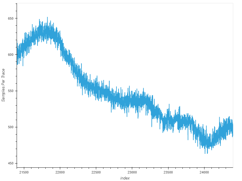
I have the attached graph from a power analysis with the H probe. What are my axis actually measuring. Am I right that the y axis is samples per trace and I assume the x axis is just trace number?
Hi,
How did you generate this plot? Is this just a raw power trace, or did you do some sort of analysis?
Alex
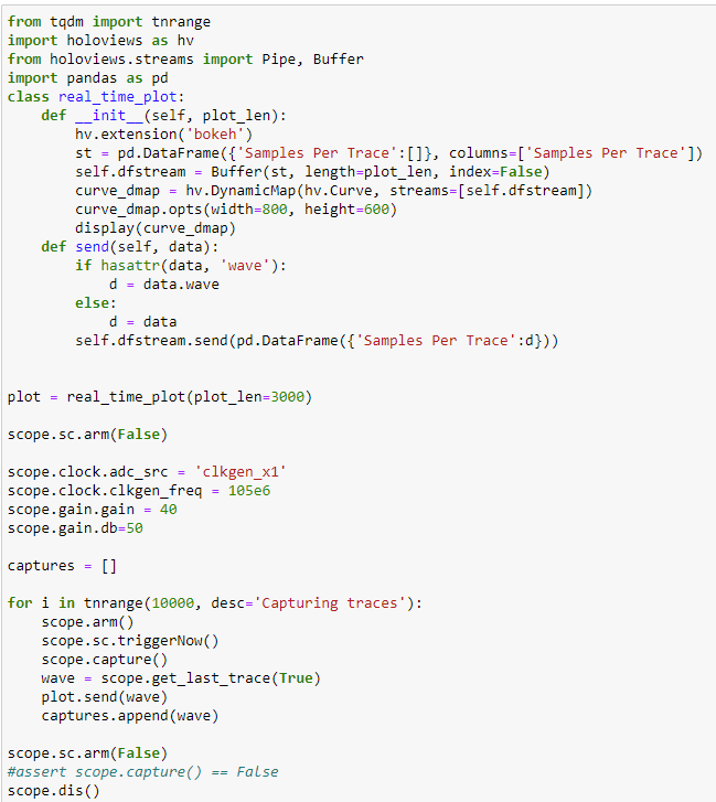
This is just a raw power trace, no analysis completed. Just creating a holoviews dynamic map as I was completing a capture
In that case, the Y axis is voltage (uncalibrated, so it’s proportional to the actual AC coupled voltage) and the X axis is time in samples.
Alex
Voltage? This seems a lot, this was a power analysis done with the H-probe on a small electronic device. Is there a maximum voltage the cw can detect? Are we saying it detected 650 volts? This is the code that was used to generate the graphs.
The measurement is of AC coupled voltage, but it’s not in volts. You can think of the value that you’re measuring as being a scaled version of the actual measurement. For power analysis, we don’t actually care what this scaling factor is. Due to the shunt resistor, this measurement is also proportional to the current flowing into the target device.
Technically, the max AC voltage that the front end can handle is 5V AC. Depending on what the CW’s gain is set to, the measurement is likely to clip and read the maximum value. In your case, you’re reading the data back as an integer, in which case the max value is 1024.
Alex
Am I right in thinking this only plots the last trace on the graph? So the value across the x axis refers to the sample number within that trace?
I think that code continuously plots new traces as they’re recorded. We do have a new method of real time plotting in the current version of ChipWhisperer: chipwhisperer-jupyter/Lab 4_2 - CPA on Firmware Implementation of AES (HARDWARE).ipynb at master · newaetech/chipwhisperer-jupyter · GitHub
Alex